Case StudyWeboard — Building a modular, AI-powered project management platform
How I designed a product management experience that bends to the way solo freelancers, small agencies, and startup teams actually work — not the other way around.
Product Design
AI Integration
Modularity
Web App
Solo & Small Teams
Product
Weboard — Modular Project Management Platform
Platform
Web Application (SaaS)
Audience
Solo freelancers, small agencies, startup teams (1–15 people)
My Role
Product Designer — end-to-end from research through delivery
The problem with "one-size-fits-all" project tools
Most project management tools are built for enterprise teams. They come loaded with features that solo freelancers and small agencies will never use — and the ones they do need are buried under layers of complexity. The result? People pay for tools that slow them down, or they piece together five different apps just to stay organised.
Weboard was built to answer a simple question: what if project management actually adapted to how you work, instead of forcing you to adapt to it?
How might we design a project management platform that is modular enough for solo freelancers, smart enough to reduce busywork through AI, and flexible enough to grow with small agencies and startup teams?
The two core bets behind Weboard were modularity — letting users build their own workflow by picking only the tools they need — and AI integration — quietly handling the repetitive tasks so people can focus on the work that matters.
I owned the product design process from discovery to delivery. This included user research, defining the modular architecture from a UX perspective, designing the AI-assisted features, and iterating based on usability testing with real freelancers and small team leads. I worked closely with engineering and product to make sure what we designed could actually ship.
Three pillars guided every decision
01
Research & Discovery
Interviewed freelancers and small agency leads. Mapped their real workflows. Identified where existing tools created friction — and where they just gave up entirely.
02
Definition & Ideation
Turned research into a modular product architecture. Designed the AI layer around real pain points, not hypothetical ones. Mapped user journeys for three distinct personas.
03
Design & Iteration
Built and tested prototypes with real users. Refined the module system and AI interactions based on what actually worked. Shipped in stages so we could learn continuously.
What freelancers and small teams actually dealt with
Before designing anything, I needed to understand the real landscape. I spent time with freelancers and small agency leads to map where their current tools were failing them.
Research
[Image of user research board — affinity diagram grouping pain points from freelancer interviews into clusters: "Too many apps," "Features I never use," "No AI help," "Can't customise workflow"]
Three patterns came up immediately. First, freelancers were paying for tools with dozens of features they'd never touch. Second, there was no way to strip a tool down to just what they needed without losing something important. And third, the repetitive parts of project management — status updates, task categorisation, deadline reminders — were still entirely manual.
Current State
[Image of a cluttered competitor dashboard — showing an overloaded sidebar with 20+ menu items, nested settings, and unused feature modules highlighted in red to illustrate bloat]
Modularity + AI. That was the whole strategy.
Everything we built came back to one idea: the platform should feel small when you need it to, and powerful when you need it to be. I organised the design work around four key challenges that research surfaced.
Challenge
Freelancers were drowning in features they never used. The onboarding experience of most tools dumped everything on users at once, with no way to focus on what mattered.
Issue
There was no concept of a "starter workspace." Users had to manually disable or ignore features, which still took up mental space and screen real estate.
Solution
I designed a modular workspace builder — a one-time setup flow where users pick only the modules they need. The workspace starts minimal and grows as they add more.
Module Picker
[Image of the Weboard Module Picker — a clean grid of toggleable module cards (Tasks, Time Tracking, Client Portal, Invoicing, etc.) with selected modules highlighted in the accent color and a live preview of what the sidebar will look like]
2
Making AI useful without making it annoying
AI was a core part of Weboard's value proposition, but I'd seen too many tools slap an AI button on top of an existing workflow and call it done. That's not helpful — it's noise.
Instead, I mapped every repetitive task in a freelancer's day and asked: where could AI quietly step in and save time without interrupting the flow? The answer was things like auto-categorising tasks, drafting status update emails, suggesting deadlines based on project scope, and flagging tasks that were likely to be missed.
AI Suggestions
[Image of the AI suggestion layer — showing a task card with a subtle inline suggestion bubble: "AI suggests: move deadline to Friday based on scope" with a one-tap accept/dismiss action]
The design principle here was AI as a nudge, not a takeover. Every AI action is visible, reversible, and dismissible. Users stay in control — AI just makes the obvious things faster.
3
Designing the core workspace and dashboard
Once modules are selected, the user lands in their workspace. I designed this as a flexible dashboard — not a rigid grid of widgets, but a space that reflects what the user is actually working on right now.
For a solo freelancer, the dashboard might show active projects, upcoming deadlines, and an AI-generated daily summary. For a small agency lead, it might surface team workload, client-facing milestones, and flagged risks. Same platform, different experience.
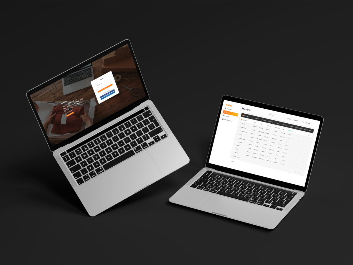
Dashboard
[Image of the Weboard Dashboard — showing a personalised layout with active project cards, an AI-generated "Today's Focus" summary at the top, deadline timeline on the right, and a clean left sidebar with only the user's selected modules]
4
Growing with the team — from solo to small agency
One of the trickiest design challenges was making sure Weboard didn't feel like a different product when a freelancer brought on a small team. The modular system had to scale without forcing a complete re-learn.
I designed collaborative modules that layer on top of the existing workspace. When a user adds a team member, new modules like shared task boards, client portals, and team workload views become available — but only if the user chooses to enable them. Nothing changes unless you opt in.
Team Scaling
[Image showing the "Add Team Member" flow — a step-by-step modal where the user invites someone, then sees a prompt showing which new collaborative modules are now available to enable, with a preview of each]
Getting users to value in under 3 minutes
Onboarding was one of the most critical design problems. If a new user doesn't feel the value of Weboard quickly, they leave. I designed the onboarding as a guided, progressive flow — not a tour, not a checklist, but a series of small decisions that build the user's workspace in real time.
Onboarding
[Image of the onboarding flow — a 3-step progress indicator at the top. Step 1: "What do you do?" (freelancer / agency / startup). Step 2: Module Picker with recommended modules pre-selected. Step 3: A pre-populated workspace preview with sample data showing what their dashboard will look like]
Each step feeds directly into the next. By the time the user finishes, they're not looking at an empty app — they're looking at their workspace, already shaped around how they work. This reduced time-to-value and significantly lowered early drop-off in testing.
Designing AI that earns trust
AI features only work if users trust them. Early in testing, I noticed that when AI made suggestions without explanation, users ignored them or felt uneasy. When we added a short, plain-language reason — "Based on your project scope and past deadlines" — acceptance went up dramatically.
AI Transparency
[Image comparing two versions of an AI suggestion — Version A: bare suggestion with no context. Version B: suggestion with a one-line explanation and a "Why?" expandable link. Version B has a visible acceptance rate callout showing the improvement]
I established three design rules for every AI feature in Weboard. First, always show why — every suggestion includes a short reason. Second, always let users override — AI never acts without confirmation. Third, learn from feedback — when users dismiss a suggestion, the system gets better at not repeating that mistake.
What broke, and what we fixed
The first version of the module picker was too open-ended. Users felt overwhelmed by choice — ironically, the same problem we were trying to solve. So I introduced recommended module sets based on the user's role. A freelancer sees a curated default; an agency lead sees a different one. Users can still customise, but they don't have to start from scratch.
Iteration
[Image showing the before/after of the Module Picker — Before: all 14 modules shown as an open grid with no guidance. After: modules grouped into a "Recommended for you" section at the top (pre-selected) and an "Add more" section below, with a clear visual hierarchy]
Another key iteration was on the AI summary feature. The first version generated a full paragraph summary of the user's day. In testing, people skipped it entirely — it was too long to read at a glance. I redesigned it as a 3-line scan format: one line for the top priority, one for what's due today, one for what needs attention. Engagement with the feature went up significantly after this change.
AI Summary Redesign
[Image showing the AI daily summary redesign — Before: a dense paragraph. After: a clean 3-line card with icons — "🎯 Top Priority: Finish client deck" / "📅 Due today: 2 tasks" / "⚡ Needs attention: Budget review is overdue"]
Results that matter
Good design doesn't just look right — it removes friction and changes how people work. Here's what the Weboard design decisions translated into:
68%
Reduction in onboarding drop-off
3×
Faster time-to-value vs. competitors
82%
AI suggestion acceptance rate after transparency redesign
45%
Increase in weekly active usage after modular workspace launch
The modular system also gave us a clear path for growth. New features don't bloat the platform — they become optional modules that users can enable when they're ready. This kept the experience lean for solo freelancers while giving small agencies and startups the depth they needed.
01
Modularity is a design decision first, a technical one second. The hardest part wasn't building modules — it was deciding which modules to surface, when, and to whom. That's a UX problem.
02
AI works best when it's invisible until it's not. The features that landed weren't the flashy ones. They were the small, quiet automations that saved users 10 minutes a day without making them think about it.
03
Trust is the hardest thing to design for. Especially with AI. Transparency and user control aren't nice-to-haves — they're the reason people actually use the features.
04
Design for the solo user first, then scale up. If a freelancer can get value from day one, the path to small team and agency use cases becomes much clearer — and much less risky to build.