Case Study · 2021–2023Arkiver — Designing clear financial data for Shopify merchants
How I crafted data visualisations and product design patterns for an enterprise SaaS plugin — and what I learned handling post-launch testing, debugging, and developer communication on a privately funded startup.
Enterprise SaaS
Shopify Plugin
B2B · Financial
React Components
MongoDB
Product
Arkiver — B2B SaaS Receipt & Invoice Management
Platform
Web App · Shopify Plugin · React + MongoDB
Team
Privately funded startup · Shopify Partner, Melbourne
My Role
Product Designer — discovery through post-launch iteration
E-commerce merchants needed a smarter way to manage their financial records
Arkiver was one of my first enterprise SaaS projects. I worked with a Shopify Partner based in Melbourne to design a B2B web application that streamlines receipt and invoice management for merchants on the Shopify ecosystem. The product sits inside Shopify as a plugin — merchants use it to track store warranties, receipts, and refunds, all in one place.
Our initial consultations focused on identifying the pain points merchants face with financial record-keeping. The core problem was clear: merchants were drowning in receipts, warranties, and refund requests spread across multiple tools, with no single source of truth.
How might we design a financial tracking tool that integrates seamlessly into the Shopify workflow merchants already use, while making receipts, warranties, and refunds easy to understand at a glance?
I owned the design from the first consultation through to post-launch iteration. That meant leading discovery sessions with the team, building moodboards and user journeys, wireframing three distinct user flows, designing the component library in Figma, and then staying involved after launch to handle testing, debugging, and communicating issues back to the development team. This was a long-running project — 2021 to 2023 — which gave me the chance to see how design decisions held up over time.
How I structured the work
01
Research & Discovery
Ran consultations with the team to map merchant pain points. Built moodboards to set the visual direction. Collected dashboard references for financial data visualisation. Mapped three user journeys: New User, Registered User, and Admin.
02
Design & System
Designed wireframes for all three user flows. Built a Figma component library — reusable buttons, input fields, data cards — so the React team could build consistently. Added Lottie loading animations at critical moments.
03
Post-Launch & Iteration
Stayed involved after launch. Handled testing, identified bugs, and communicated them clearly to the dev team. Iterated on the design based on real merchant feedback and usage patterns over the full project lifecycle.
Designing for three different users at once
One of the first things I mapped out was who was actually using Arkiver — and how differently they'd interact with it. The user journey work identified three distinct types, each with their own goals and friction points.
New User Onboarding was the most sensitive flow. A first-time merchant needs to connect their Shopify store, import their initial receipts, and understand what the dashboard shows — all without getting lost.
Registered Users come back every day. Their dashboard needed to surface the things they check most often: recent receipts, spending patterns, and merchant summaries.
Admins needed full visibility and control. They manage users, configure warranty rules, and monitor refund activity across the business.
Making financial data readable — not just displayable
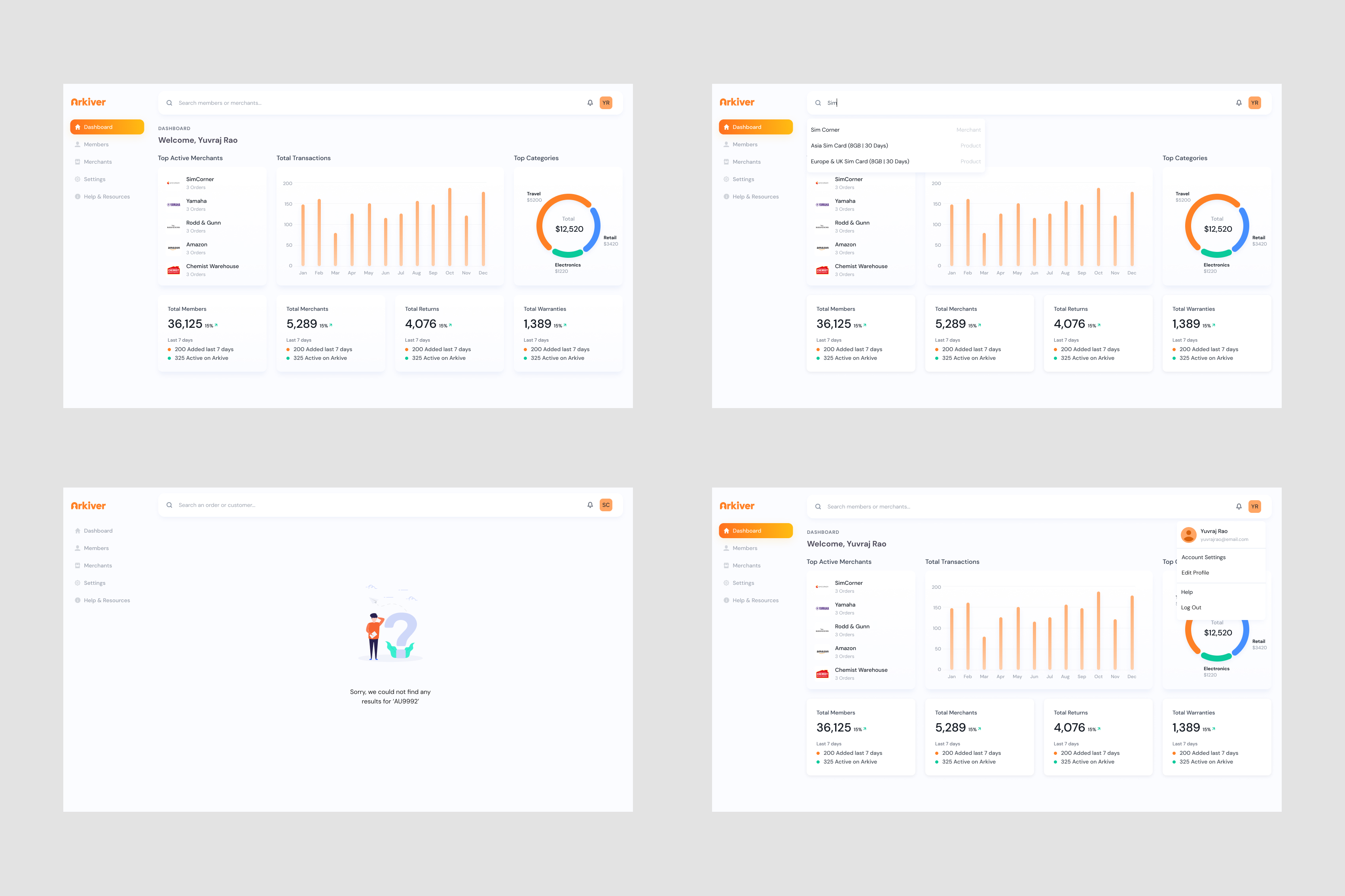
This was the part of the project I spent the most time thinking through. Financial data is dense. If you just dump numbers on a screen, merchants won't look at it. The goal wasn't to show everything — it was to show the right things in the right way so merchants could make decisions quickly.
Receipts
Recent activity first
Receipts are the most frequent data type. I designed these as a scannable list sorted by date, with clear status indicators — not a chart.
Refunds
Status-driven, colour-coded
Refunds need attention. I used colour-coded status badges — pending, processing, completed — so merchants could spot anything that needs action.
Warranties
Timeline over totals
Warranties are time-sensitive. I chose a timeline view rather than a summary chart because the merchant's real question is 'what's expiring soon?'
Summary
Numbers, not graphs
For the main dashboard summary cards, I chose large, clear numbers over sparkline charts. Merchants glance at their dashboard between tasks.
Dashboard Design
[Image of the Arkiver dashboard — top row shows four summary cards with large numbers: Total Receipts, Active Warranties, Pending Refunds, Revenue This Month.]
Building a consistent system, not just screens
Because Arkiver runs as a Shopify plugin built with React components, consistency wasn't optional — it was critical. I built a Figma component library early and designed around a set of reusable patterns.
Progressive Disclosure
The app surfaces information based on what the user needs at that moment. New users see guided steps. Registered users see their dashboard immediately. Same product, different depth.
Status as Signal
Across receipts, refunds, and warranties, I used a consistent colour-coded status system. Green = complete. Amber = in progress. Red = needs attention.
Data Cards
All financial records use the same card component with a consistent hierarchy: title, status badge, key detail, and action. The React component is reusable. The mental model is consistent.
Loading States
I integrated Lottie animations at critical moments — especially during Shopify store connection and data import. These told merchants 'something is happening' during the moments when waiting felt longest.
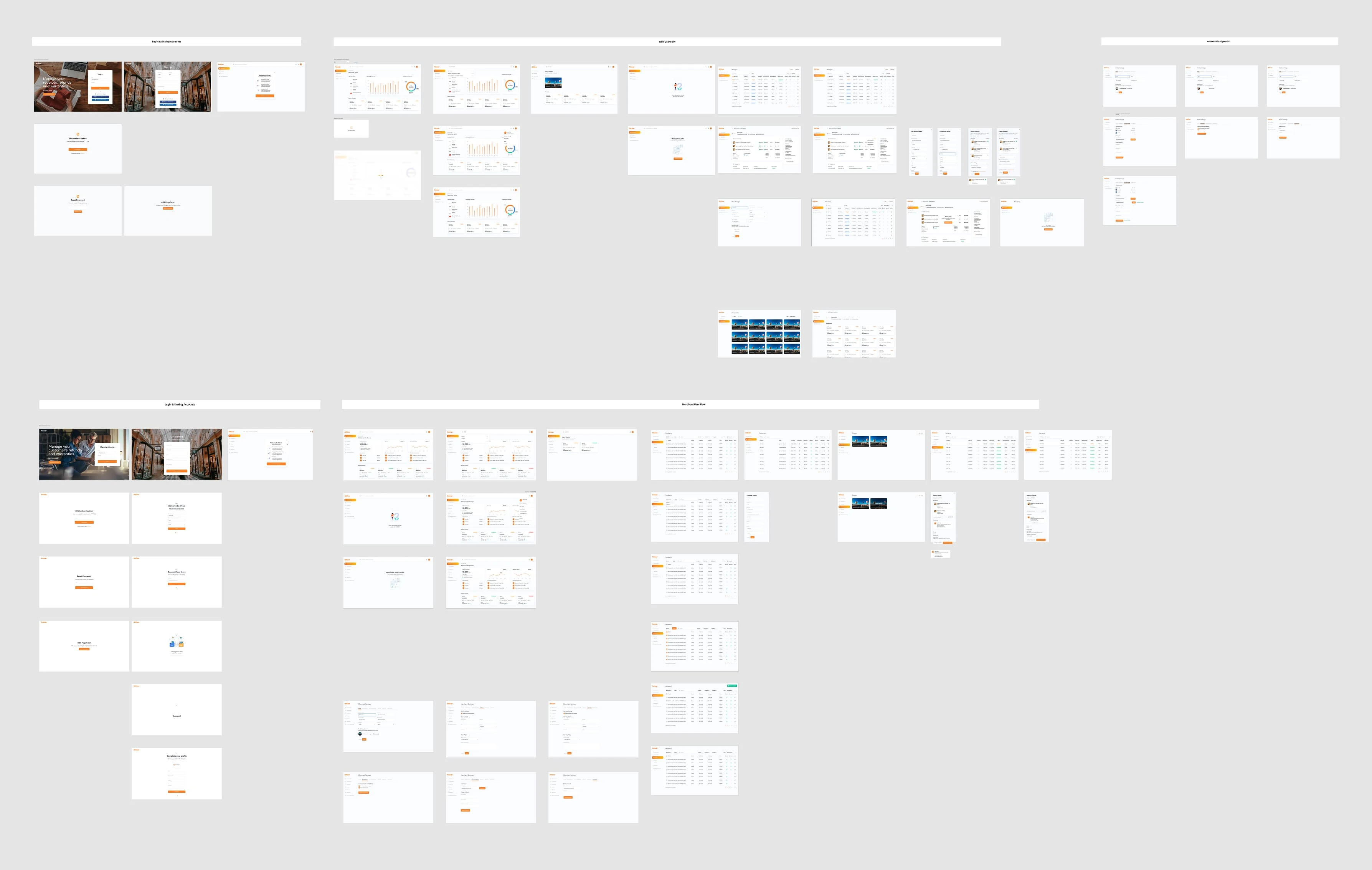
From flows to screens
I mapped the essential user flows before touching wireframes. The app flow was shaped by the team — they understood the Shopify merchant market — and my job was to turn that into screens that felt intuitive.
User Flow
[Image of low-fidelity wireframes — three screens side by side for New User onboarding, Registered User dashboard, and Admin panel.]
1
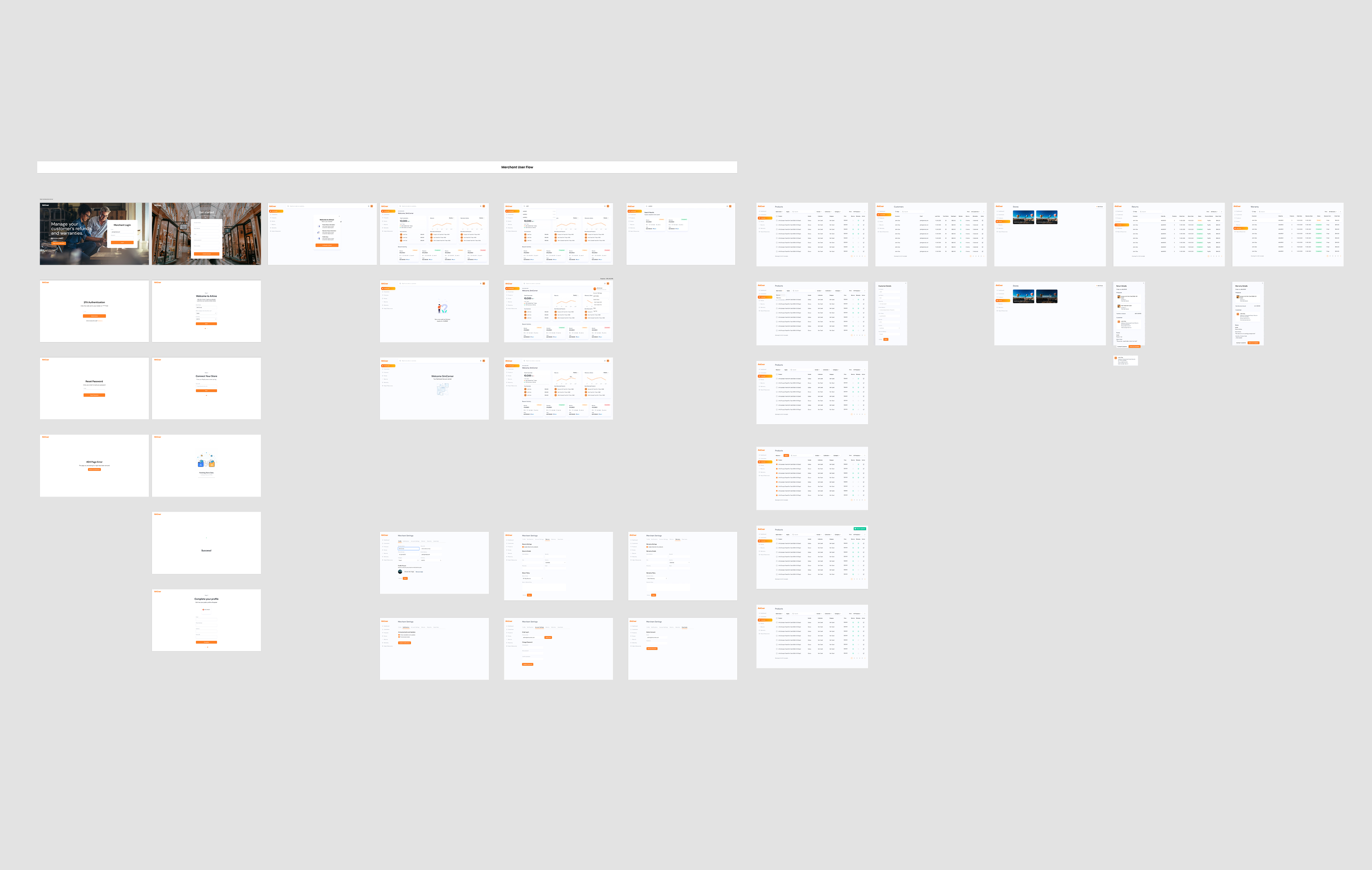
Translating wireframes to high-fidelity UI
Once wireframes were approved, I moved into Figma for the full visual design. The direction was clean and professional — this is a financial tool, so it needed to feel trustworthy and precise.
Merchant Flow
[Image of the high-fidelity UI screens — the dashboard with orange-accented summary cards, receipt detail view, and admin warranty configuration screen.]
2
Preparing for development
For handoff, I organised all UI components in Figma and exported assets according to Shopify app specifications. The component library was structured so the React developers could build each element consistently.
Testing, debugging, and talking to developers
This is the part of the process most design portfolios skip over. But for a privately funded startup building an enterprise SaaS product, post-launch is where design decisions actually get tested against reality. I stayed involved after launch specifically to bridge the gap between what we designed and what merchants actually experienced.
My approach was straightforward: reproduce the bug myself, document exactly what's happening, and communicate it in a way that saves the developer time. No vague 'it's broken' messages. Just clear, step-by-step documentation.
What the design decisions translated into
Arkiver ran for two years. That's long enough to see whether design decisions hold up — or fall apart under real usage. The patterns I built into the product from the start stayed consistent throughout.
3→1
User types handled in a single unified design system
<24h
Average bug-to-fix cycle through clear dev communication
2 yrs
Design system stayed consistent across the full product lifecycle
The component library and design patterns I established early meant that as the product grew, new screens and features could be added without redesigning from scratch.
01
Data visualisation is about decisions, not displays. The question isn't 'how do I show this data?' It's 'what does the merchant need to know right now?'
02
Design patterns save you later. Building a consistent component system early meant I never had to reinvent the wheel for new features.
03
Post-launch is where design gets real. No amount of testing before launch catches everything. Staying involved after shipping is part of the design job.
04
Communication with developers is a design skill. Reproducing bugs clearly and giving developers enough context to act fast — that's how good products ship and stay stable.